
This was the first project I did whilst studying at Google UX Design.
The task assigned to me was to do the below.
Design a movie trailer app for a movie theatre
I took Filmhouse Cinema, an existing company, as a case study, did some research, and found out that users can watch a movie trailer from the mobile app but can't book a seat reservation, also the interface isn't user-friendly. So I redesigned the mobile app to suit users' experience and make sure users can book seat reservations in other to eradicate the long queue at the cinema waiting to get a ticket.
Project Overview
The product:
Filmhouse Cinemas is a dynamic film exhibition company with a style that incorporates multifarious features, including state-of-the-art cinema technologies and luxurious dine-in cinema services; administered by professional operations management.
Project duration:
2 months
My role:
UI/UX Designer
The problem:
Users want to be able to view a movie trailer from the app, there is always a long queue to purchase a ticket whenever users go to the cinema to watch a movie and they are always attended to late by the cinema's representative.
From my research, users would prefer to have a feature on the app where they can buy a movie ticket, book a seat reservation, and also order snacks, food & drinks whilst watching a movie at the cinema.
Tool:
Figma
Responsibilities:
Conduct Interviews, Paper and Digital Wireframes, Low and High-Fidelity Prototypes, Conduct Usability Studies, Account for Accessibility, and Iterating on Designs
The solution:
I designed a seamless user-friendly app for Filmhouse Cinema that allows users to watch a movie trailer, buy a movie ticket, book a seat reservation, and also the ability to order snacks, food & drinks.
Design Process
These are the processes I leverage in other for me to understand the users, and their pain points and create an innovative user-friendly interfaces for a seamless user experience.

Understanding the Users
Being my first case study, I leverage quantitative research to understand users' pain points, motivations, and behaviors. I sent out a Google form with some questionnaires to gain some insights from the user's perceptive.
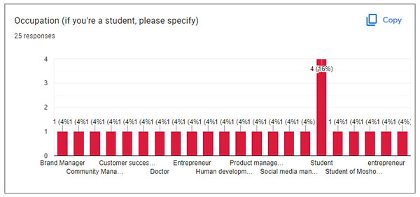
From my research, I got 25 responses in which 16% of the users are students, while the rest are employers cut across different business sectors, so for the sake of this case study, I focused more on the students and designed it to fit their needs and wants.
The chart shows that 16% are students. It gave me an insight that students are more users than employers.
When I asked the users if they have surfed on a movie theater app to watch a movie trailer before, most of the responses I got were "no" and most of these were complaints based on past users' experience with mobile apps.

This gave me the confirmation that creating a feature in the mobile app where users can book a seat reservation will be a good user experience.

User Research
I conducted interviews and created empathy maps to understand the users I’m designing for and their needs. A primary user group identified through research was students, who would love to have a mobile app that allows them to watch a movie trailer, buy a movie ticket, book a seat reservation, and also order snacks, food & drinks whilst watching a movie at the cinema. In addition, see previous reviews or overall information about the movie.
This user group also confirmed that there’s always an unbearable long queue at the cinema whenever they go to the cinema to watch a movie. Research also revealed that some adults can’t stand for too long because of their health.
Pain Points
1.
Accessibility
Platforms for watching a movie trailer, buying a ticket and booking a reservation are not equipped with assistive technologies.
2.
Time
Unbearable long queue
at the cinema.
3.
Difficult to use
Users want to use an app that has a seamless user-friendly interaction.
User Persona
Problem statement:
Aminat is a student and a full-time entrepreneur who needs a movie theatre app that allows her to watch a movie trailer because it enables her to her decision-making on which movie to watch.


User Journey Map
Mapping Aminat’s user journey revealed how helpful it would be for users to have access to a dedicated Filmhouse Cinema app.

User Flow

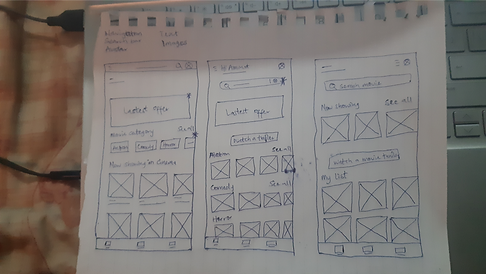
Paper Wireframes
Taking the time to draft iterations of each screen of the app on paper ensured that the elements that made it to digital wireframes would be well-suited to address user pain points. For the home screen, I prioritized a quick and easy movie selection to help users watch the trailer.
PS: Stars were used to mark the elements of each sketch that would be used in the initial digital wireframes.

Digital Wireframes
As the initial design phase continued, I made sure to base screen designs on feedback and findings from the user research. Easy navigation was a key user need to address in the designs in addition to equipping the app to work with assistive technologies.
Movie Category
This is a movie category section where users can select a particular movie category of their interest.

Assistive Technology
I included a speaker feature where users with disability can use the voice assistant on the mobile app for their usage.
Offers
Users can enjoy daily, weekly and monthly offers.

These are the 2 kinds of users the mobile app is designed for;
1. Student
2. Employed
Information Architecture
As the initial design phase continued, I made sure to base screen designs on feedback and findings from the user research. Easy navigation was a key user need to address in the designs in addition to equipping the app to work with assistive technologies.

Low-Fidelity Prototype
Using the completed set of digital wireframes, I created a low-fidelity prototype. The primary user flow I connected with was watching a movie trailer, booking a seat reservation, and ordering food and drinks so that the prototype could be used in a usability study.
Usability Study: Findings
I conducted two rounds of usability studies. Findings from the first study helped guide the designs from wireframes to mockups. The second study I used a high-fidelity prototype and revealed what aspects of the mockups needed refining.
Round 1 finding
1. Users want easy access to buy a ticket
BEFORE

AFTER

I created a "Buy ticket" button on the home page for easy access to enable a good user experience
Round 2 finding
1. Food & drinks feature can't be found on the home screen
BEFORE

AFTER

Initially, the Food & Drinks button is in the hamburger menu but users couldn't navigate through to find it so I created another button on the homepage for quick access.
Mockups


High-Fidelity Prototype
The final high-fidelity prototype presented cleaner user flows for selecting and watching a movie trailer. It also meet user needs for buying of ticket, food & drinks, and booking a seat reservation.
Accessibility Considerations
1.
Provided voice assistant for users with disability by adding speaker for a voice recognition.
2.
Used icons to help users navigation easier.
3.
Used detailed imagery of movies to help users recognise their choice of movies.
Design System
Typography

Color Palette

Icons

Existing Product - Mobile Application

Solutions I came up with for the Mobile Application
1. Focused the mobile app on two major users;
- Students
- Employees
2. Created a coupon of 20% discount for students upon successfully scanning their student ID Card, this action will automatically skyrocket the number of users.
3. Ability for users to watch a movie trailer with ease.
4. Ability to book a seat reservation in other to eradicate the long queue users encounter at the cinema.
5. Ordering of food & drinks.
6. Ability to download, scan and share their ticket.
Going Forward
Takeaways
Impact:
Users find the app easy and seamless to use, also gives users the feeling that their needs and wants are prioritized.
One quote from peer feedback:
“I really find the app user-friendly, seamless to use. I'm definitely using the app over and over again”.
What I learned:
While designing the Filmhouse Cinema app, I learned that the first ideas for the app are only the beginning of the process. Usability studies and peer feedback influenced each iteration of the app’s designs.
Next Steps
1.
Continuously conducting usability studies to validate if the pain points users experienced have been effectively addressed, also how I can iterate how the designs.
2.
Conduct more user research to determine any new areas of need.

Nickie's Kitchen
Responsive Website

Loom
Website Design
