
Responsive Web Design for Nickie's Kitchen
Deliverable:
Responsive Web
Project duration:
2 months
My role:
UI/UX Designer
Tool:
Adobe XD
Project Overview
The product:
Nickie's Kitchen is an online food vendor that cooks freshly made meals with natural ingredients. Foods are prepared on pre-order and delivered the same day.
The problem:
Users like bachelors, single mothers & fathers, families, etc. want to be able to order food in bulk quantities from the comfort of their homes whenever they want to eat without the hassle of standing in a long queue for hours at any restaurant before they could get their food. Also, sometimes they are unavailable to cook every day for themselves or for their families so having a bowl of food at their disposal will help ease that out.
The solution:
I designed a responsive website for bulk ordering checkout flow for a restaurant, where users can order bulk quantities of their choice of hot local food in liters/bowls. For this project, my main focus was a bachelor, that would like to order bulk quantities so that he can refrigerate the food whenever he wants to eat because work gets in his way most time and he doesn't have the time to cook.
Responsibilities:
Conduct Interviews, Paper and Digital Wireframes, Low and High-Fidelity Prototypes, and Iterating on Designs.
Design Process
Each process was taken for a proper understanding of the users, and their pain points, and to create an innovative user-friendly interface for a seamless user experience.


Understanding the Users
User Research
It is crucial to put the users first in the design process because any decision made will enhance the user experience. I conducted user interviews for different groups of people from different backgrounds, after the interview, I was able to gather the users' pain points, which gave me a proper insight to design a good user experience.
For this project, I focused on a particular user group, this user group confirmed that there isn't always leisure time for them to cook because of work activities, there is always an unbearable long queue at the restaurant, and also they don't want to keep ordering every day because of the high rate of delivery fee.
Pain Points
1. Ability to order in liters: To be able to order food in liters that will last for a couple of days will ease the stress of having to order every day.
2. Unavailability to cook every day: Users don't have the leisure time to cook every day.
3. Long queue: Unbearable long queue at the restaurant.

User Persona
Problem statement:
As a businessman and bachelor, I want to be able to order food in liters from the comfort of my home whenever I want to eat, because I don't have the leisure time to cook every day.

User Journey Map
This enhances James' decision on how he navigates the website to make an order, this also revealed if the user experience is friendly or not.
Ideation

.png)
I did a quick ideation exercise to come up with ideas for the responsive website. This made it easier to have a clear picture of how I wanted the responsive website to look. The starred (*) areas are what I combine to achieve the desired flow of the responsive website.


Sitemap
While users may use any page as a starting point, the Homepage is the first node in the sitemap which then branches to the next level; home, about, menu, search, login/signup, contact, cart, testimonials, and footer. Each of these parent pages leads to the children's pages.

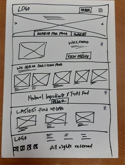
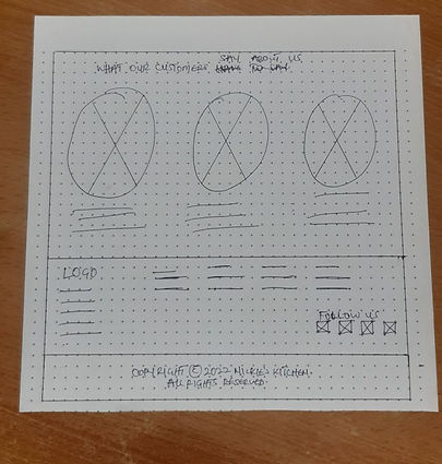
Paper Wireframes
I brainstormed and sketched out different ideas for the homepage and other screens for the responsive website. Making it user-friendly for users considering the layouts and elements used.


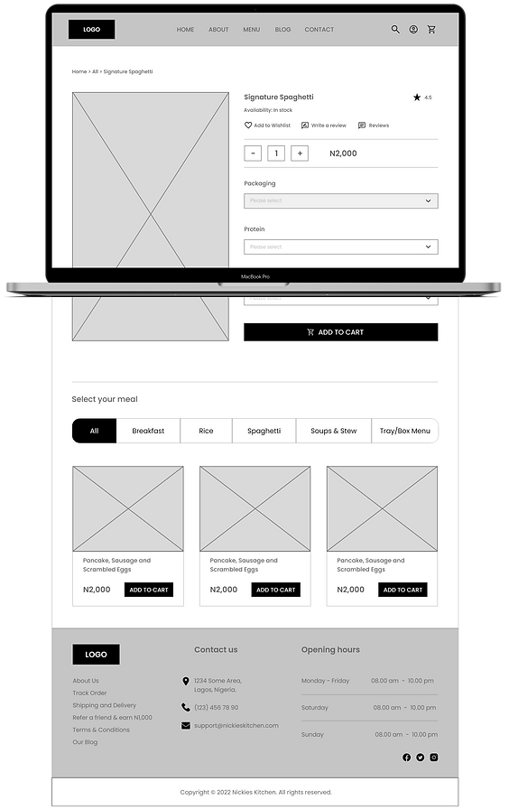
Digital Wireframes - Website
After ideating and sketching some paper wireframes, I created the designs for the responsive website. These designs focused on how users can make bulk orders from the website.


Digital Wireframes - Mobile


Low-fidelity Prototype - Website
Having the usability testing stage in mind, I created a low-fidelity prototype that connects the user flow of ordering food in liters/bulk with some proteins, and the users' preferred choice of drinks.
Low-fidelity Prototype - Mobile
Mockup - Website


Mockup - Mobile


High-fidelity Prototype - Website
The high-fidelity prototype followed the same user flow as the low-fidelity prototype, including design changes made after the usability study.
High-fidelity Prototype - Mobile
Going Forward
Takeaways
Impact:
- Users can order in bulk.
- Users can always refrigerate their meals any time they want to eat.
- Users don't need to stay in a long queue before they can order.
What I learned:
As a person who loves his food, I learned that the problem I was trying to solve was essential, so diligently going through each step of the design process and aligning with specific user needs helped me come up with feasible and valuable solutions.
Next Steps
Continue to develop the
design by adding more
pages in order to accomodate more varieties of meal for users to pick from.
Iterate as much as possible until it is at a place where I believe users could navigate seamlessly.
To make sure the next usability study reaches a wider audience in order to get additional feedback, and iterate on the design
based on the feedback.
See more of my works:

Loom
Website Design

PiggyVest
Mobile Application
